Big Ideas Start With Small Sketches
Every big idea starts somewhere. Maybe it’s a scribble on a post-it note, or a doodle during a meeting that was supposed to be about something else entirely. Long before our work shows up polished, it lives on page 42 of an old sketchbook, surrounded by more crossed-out ideas than kept ones.
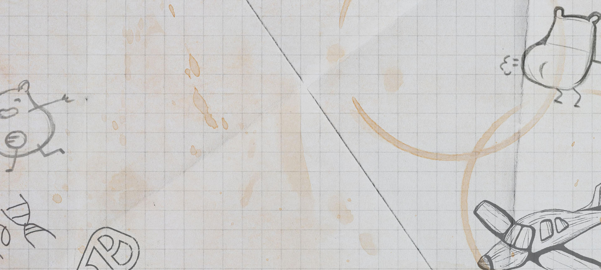
As a look into who we really are at Stoltz (spoiler alert: we’re humans), we asked our creative team to send us a page from their sketchbooks. Welcome to the messy middle of our creative process.
Clara Thamke
Art Director
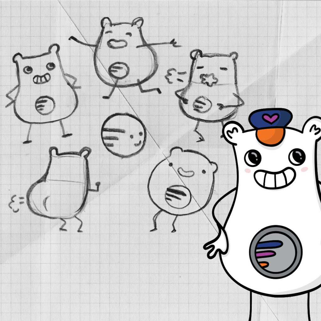
Valley Regional Transit | Lil Rider Mascot
“I knew that I wanted him to have a big personality, be super cute and squishy, and somehow incorporate the VRT logo. I wasn’t sure if he would just be a sphere with the logo, but after sketching that out, I thought he looked a little too much like an old man’s head. I decided to add ears to give me more to work with in conveying expressions, and gave him a rotund booty to add another humorous element.”
Lexy Hawley
Art Director
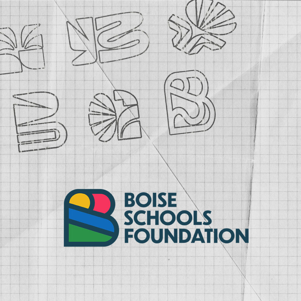
Boise Schools Foundation | Logo
“I like to start my process by making lists of everything that made me think of Boise School Foundation. From there, I grouped those raw ideas into different themes and concepts. Once the frameworks were in place, I came up with as many ideas as I can until it starts feeling right. I kept coming back to the “B” logos that subtly incorporated a horizon line and elements of Boise’s nature.”
Mitch Kuhn
Executive Creative Director
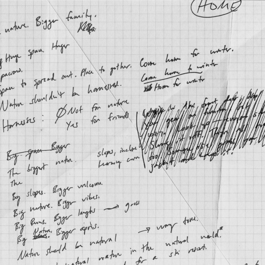
General Campaign Concepting
“When I’m starting a project, my first step is to just write down all the things. Headlines, manifestos, quick sketches, random references. I just let the pen go without judging any of it. Then, I walk away for a bit. When I come back, I can usually pull out the two or three nuggets of potential. Don’t look too closely… There are definitely some weird ones in there.”
Kellie Fox
Associate Creative Director
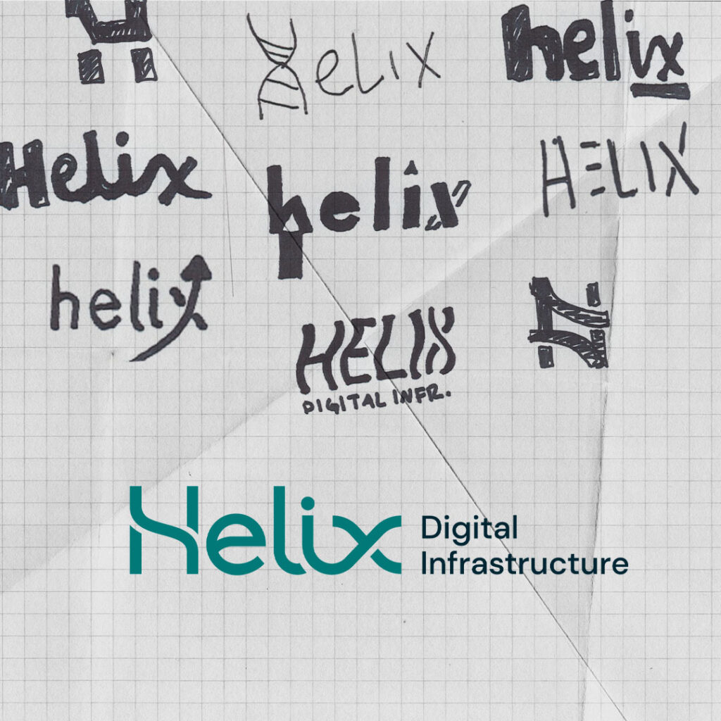
Helix Digital Infrastructure | Logo
“We wanted to tie the design back to a helix shape, but without taking the expected route. We ran through endless iterations to push the concept as far as possible and see every way it could take form. Since it needed to thrive in a digital environment, we were aiming for a strong standalone mark, but we also wanted typography with enough personality to do some heavy lifting on its own.”
Emily Muller
Art Director
Spokane International Airport | Hawaiian Shirt
“When I started designing the Hawaiian shirt, my original plan was to stick with clean, sharp elements. But once I got into the digital sketching phase, I realized the raw, rougher lines actually gave the art a lot more character. We ended up keeping the sketched style for the final design (with a few necessary refinements, of course).”
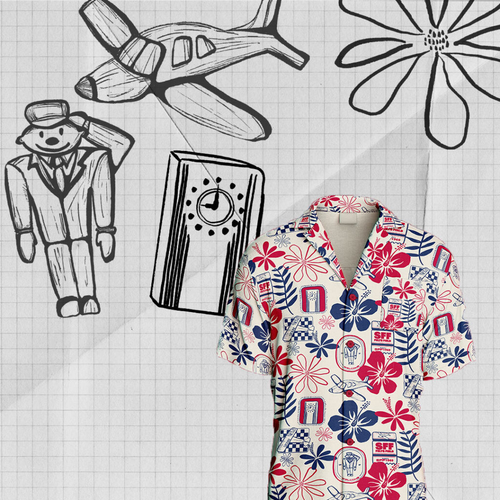
If this chicken scratch tells you anything, it’s that great ideas rarely arrive fully formed. They show up in all forms, but with a little experimentation, exploration, & collaboration, these sketches get their moment to shine as the truest expression of a client’s brand on billboards, bus wraps, and sometimes…mascots.